Hello again, puddin' cups! I'm finally back after a hiatus filled with projects. I would like to present to you the third instalment of my story-like piece inspired by the word, "Sky".
Due to the complexity and number of steps to create this piece, I'll be posting the end results of some steps of my process. Also, the photo that I've incorporated into this image was rendered using photoshop and reference to a real photo of a friend of mine. With her permission, I was allowed to use her photo as reference and to respect her wishes of anonymity; I have not taken pictures of the process of recreating her photo.
Due to the complexity and number of steps to create this piece, I'll be posting the end results of some steps of my process. Also, the photo that I've incorporated into this image was rendered using photoshop and reference to a real photo of a friend of mine. With her permission, I was allowed to use her photo as reference and to respect her wishes of anonymity; I have not taken pictures of the process of recreating her photo.
Part 1: Thumbnails and components
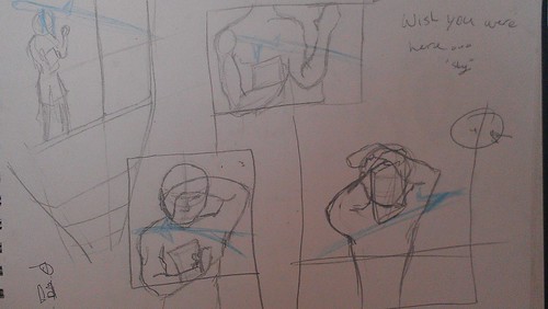
1. Thumbnails; the hardest part was deciding a proper perspective and what to focus on. My first thoughts were to include a person and try to focus on them. I then rethought the entire image and decided to have only one 'person' in the image.
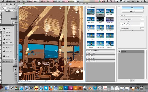
2. (3.) After I created the image to be in the photo frame, I needed to incorporate a background that would appropriately create a 'romantic' feel. I played with a few filters after finding an image I liked on google, resized, cropped, and then used the 'Cutout' filter to create a vector like feel.

3. I then placed the rendered image of my friend over the background, resized and decided to add a gradient that would highlight her eyes.
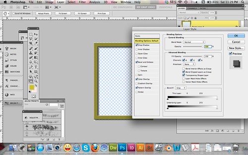
4. To create the frame, I used the shape tool and made a single thin yellow rectangle and replicated it 3 more times. After making the shape of the frame, I merged the layers and then added a few effects as noted in the screenshot.
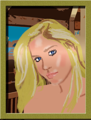
5. Final Photo. This was the main component, not that it'd be as large as it is now.
Part 2 Digital completion
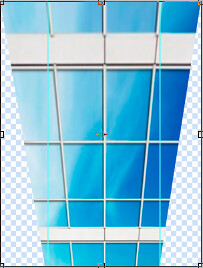
6. To make the overall piece a bit more dynamic, I took my background and skewed it.
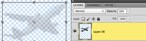
7. Another component was the plane. After using quick selection and command + J to create it on a separate layer, I reduced the opacity to help it appear as more of a reflection on the background.

8. Though the plane would be barely seen, I didn't want the harsh edges to be what people focused on. I used the palette knife filter.
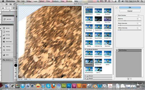
9. Another portion was the counter top on which the photo would rest. After creating the counter top, I used the Dark Strokes filter to help it look a bit more like marble.
Final!
This is the final. The photo on the counter has a drop shadow and I hope it can be understood as to why I did so much for the photo itself. I couldn't have just any blurry image. It wouldn't make sense to me and the story.
I feel that it came together well and do hope you like my first all digital piece (not including thumbnails).
Stay tuned for my NEXT post. "Glasses" is your clue!!
No comments:
Post a Comment